The Kinetics of the Jewelry Box
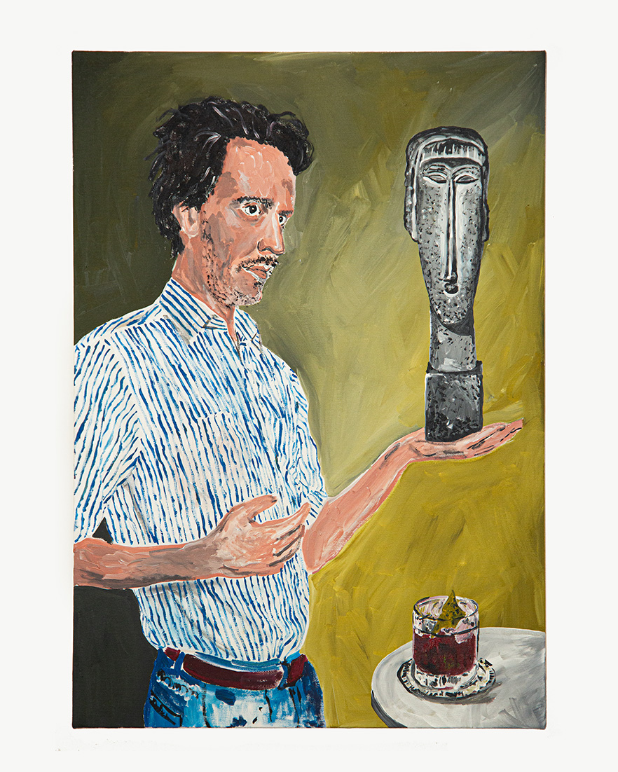
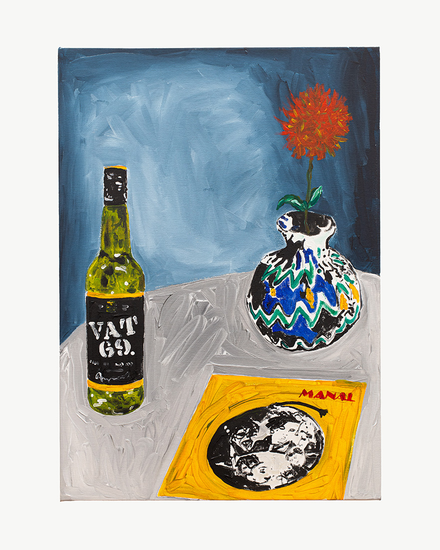
When I think of a painting by Bruno Gruppalli, I think of those hand-shaped jewelry boxes where someone might leave rings or bracelets upon arriving home. The painting has the inertia of an arrival: as if the movement that brought things there lingers in the arrangement of the objects.
Like those vanity pieces popularized in the postwar period, the canvas receives social signs in a state of rest. It is a transitory point of support for cultural objects tired of circulating. The surface doesn't completely order them, but neither does it abandon them: it transforms their circulation into a form of authority.
The Display Case of Saint Anthony
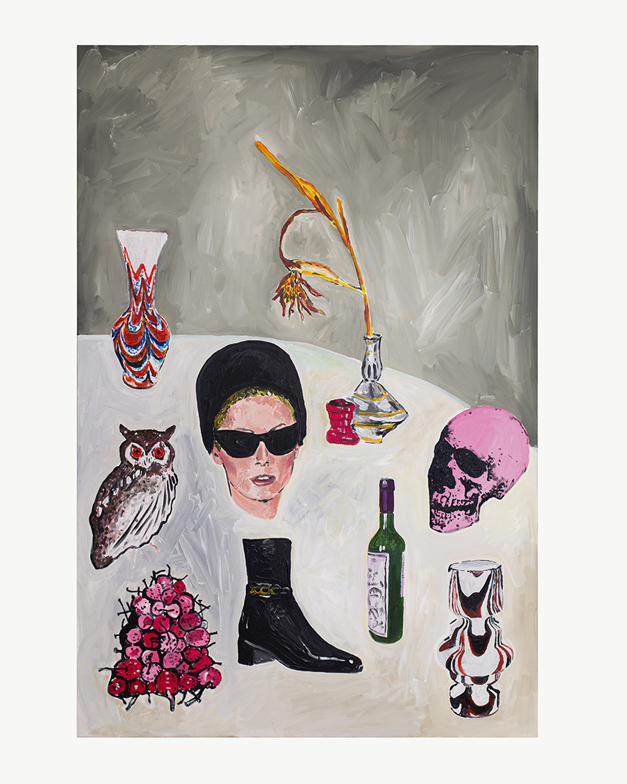
This form of appearance has something of the iconography of the Seven of Cups in the Rider-Waite-Smith tarot: chalices that float where heterogeneous figures appear, visual promises, objects of desire. The card is not interesting as a divinatory emblem, but as a small theory of supply. These are things that are shown together before becoming narrative, property, or choice.
The image drawn by Pamela Colman Smith for the 1910 gavel can be interpreted as a minor revival of an ancient iconographic tradition: the eremitic image of the vision, in which figures erupt from the realm of ordinary presence: in the air, among clouds, for a solitary body that watches them proliferate from the solitude of the desert. The figure of the anchorite before a multifaceted field of unstable apparitions is particularly recognizable in Flemish and Germanic painting and prints, and is intensely revived in the 19th century. The Temptation of Saint Anthony, for example, functions as a laboratory of heterogeneous visuality: monsters, objects, bodies, fantastical architectures, and promises of pleasure are presented without any secure connection, as if withdrawal from the world opened up this zone of proliferation.
The reemergence of this lineage at the beginning of the 20th century touches upon the phantasmagoria of the commodity. In the visionary showcase that the city of early spectacular capitalism becomes, objects appear less for what they serve than for what they are capable of promising. Things seem to speak for themselves, as if the social life that produced them had been folded onto their surface.
Each painting creates a community where things seem to talk: they don't form an assembly, but rather a forum without clear rules of exchange. Each painting produces a collection, but not in the noble form of a palace of memory, but as a minor form of accumulation: a dumping ground, a wasteland where things go to forget themselves.
Parking
Perhaps we need to look at another scene to understand this arrangement. Gruppalli's things don't seem placed, but rather left. They are parked on the canvas with the informality of cars that stop in an unlandscaped public space or along a river outside the city: without symmetry, without a common axis, without complete obedience to any rule of position. In the city, a car parked along the curb displays a sign of civility. Outside of that spatial order, the car's position is merely a sign of desire: the signal that it was at that point, and not another, that the driver chose to stop. The point where they stopped and said: this is it.
The effect produced by this logic of inscribing things on the canvas has an animistic tinge: it's as if the objects possess a will, and first and foremost, the will to choose the place where they want to be, like the Virgin who, according to legend, prevented the cart from moving forward upon reaching Luján. In these paintings, the apparent agency of the objects sounds less like the miraculous intentionality of a cult image than like the false autonomy of a commodity. But in its reiteration of motifs, Gruppalli's style retains something of the colonial sculptor; the latter carved the same saint again and again, while Gruppalli paints Warhol's skulls or Grace Jones's head again and again.
The Management of Contact
The painter's working method emphasizes the priority of the objects: the figures are painted first, only then is the background pushed into the residual space between them. The background bears the mark of contact. It doesn't function as a neutral space but as a surface deformed by the prior presence of the objects. The relationship between figure and ground ceases to be compositional and becomes indexical. The direction of the brushstrokes reveals this posteriority: the background is organized under the pressure of the outline. It becomes a function of the object.
Snack Culture
The paintings open a zone of contact between material histories of the image. But these histories are not so far removed from one another. The juxtaposition of signs taken out of context has been, for decades, a technique used to create a clash between different cultural levels. Here, however, the procedure doesn't so much emphasize the distance between these levels as their shared availability. The signs almost always come from pop culture, but the painting doesn't insist on the contrast between high and low, but rather on their capacity to become equivalent: to be understood through the same system of notation.
The technique works like an abbreviation. An exercise in pictorial shorthand that pastes notes of color with blacks and whites. The brushstroke is nervous, but this nervousness doesn't express an inner world, but rather a graphic objectivity: the tremor of an image subjected to operations of synthesis, cropping, and poor printing. Two characteristics of the sign are emphasized: autonomy and portability. Autonomy separates it from the spatial syntax of the background. Portability is inferred from its repetition: each motif can reappear in another painting, alongside any other motif, without losing its identity.
Gruppalli speaks of stickers, but the word doesn't simply refer to an iconography. Name a status of the image. In platform communication, the sticker is a graphic unit of micro-exchange that adheres to a conversation. It comes from a brief history of affective signs: from the emoticon made with characters to the emoji stabilized as a pictogram; from there to the sticker as an available image. Once stamped in the chat, it is quickly reabsorbed into the flow of the conversation. In Gruppalli's work, this post-alphabetic logic appears diverted toward an earlier materiality. His figures not only insist on remaining, but also dispense with the vector smoothness of instant communication. Instead, they possess the poor charms of the cheap decal: hard outline, solid color, plastic sheen, barely blurred registration. Sometimes they are still lifes, if one must call them that, but assembled from remnants of adhesive graphics. The paint peels objects from one circulation and reattaches them to another surface. Style lies in the awareness of the mark left by this transfer.
* Special for Hilario. Arts Letters Crafts